Today we are excited to launch our first modern UI toolkit to help our customers to confidently design their SharePoint sites and pages. Thank you to all of our customers and MVPs who have contributed to our understanding of your needs and ideas in how we can better set you up for success with this effort. We’ve used Figma, the industry standard tool for web design, to deliver a set of web parts, styles, and templates that make creating engaging sites much easier than was previously possible.
Download the file from the Microsoft Community page in Figma.
The first iteration of the SharePoint Web UI kit will allow you to design a company and organization news communications site based on the example provided in the SharePoint look book.
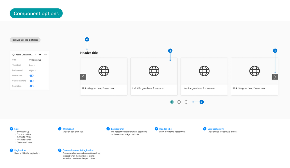
It includes the following web parts: Button, Events, Hero, Image, News, Quick links, Spacer and Text, as shown below.

You can now use Figma page templates to create page layouts for your SharePoint site. Update the layout with Figma components that you can drag, drop, and modify as needed, giving you more time to figure out the best experience for your users.
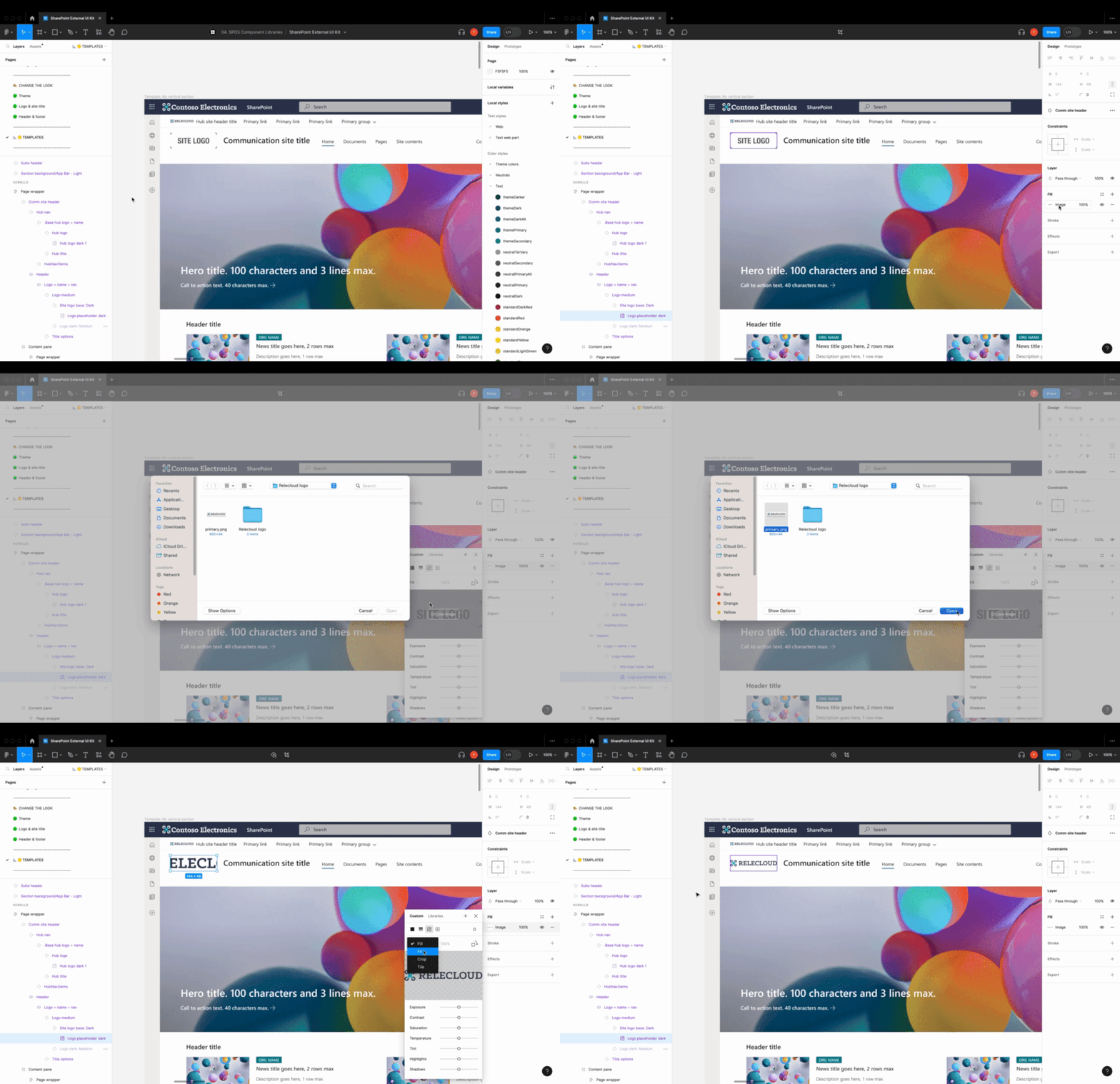
And you can customize your site layouts by adding your own brand colors and logos.
Add and configure web parts with ease the Figma components for each web part include sizes for each section type. They can be configured by changing layout categories and layout options like you would in SharePoint. Edit the web parts and add your content to finalize your design.

This tool kit includes detailed guidance on how to update and modify the content for each part of the site including the header and footer, sections, and web parts.
And this is only the beginning; we know we’re far from providing everything customers need. We will be publishing regular updates to the toolkit, and plan to add more templates and capabilities, including Team sites, more web parts, and multiple form factors including mobile. We also plan on building out robust guidance and best practices.
Please tell us what’s missing, what doesn’t work for you, and where your biggest challenges are by visiting the SharePoint Feedback Community at aka.ms/feedback/sharepoint. We will use your feedback to guide our prioritization roadmap, which we will also provide visibility into.
While we have a long way to go, we’re proud of this first step and excited to get these tools in the hands of our customers. Thank you!


