Introduction
Last month we announced that Microsoft 365 Security Center had reached general availability and we provided our readers with a quick end to end tour of the top experiences. Since then it’s been exciting to see the number of new customers using Microsoft Secure Score for the very first time almost tripling while the blog became one of the top viewed items for the month of March. In this month’s blog we’d like to provide additional details on Microsoft Secure Scores’ redesign and new capabilities.
You asked, so we delivered
For this release your feedback on suggested we should focus on following four priorities and that’s exactly what we decided to do:
- Integrating it within Microsoft 365 security center instead of having it be a stand-alone console
- Organizing the experience around the Microsoft Threat Protection pillars
- Improving usability and decreasing decision-making time
- Enriched the API so it has complete access to all Microsoft Secure Score data
A New Home
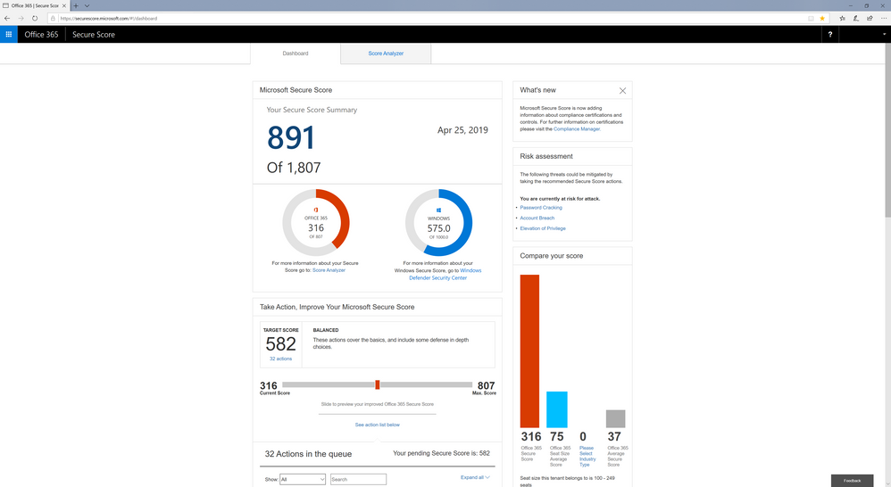
The first and most obvious difference customers will notice is that Microsoft Secure Score is no longer hosted on its own website (securescore.microsoft.com) as shown in the image below.
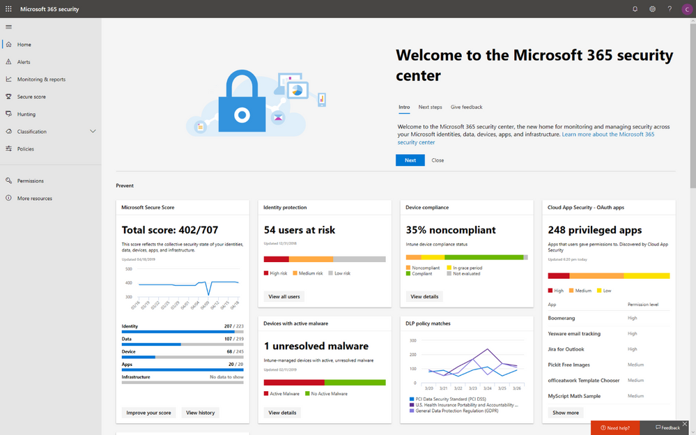
Instead its functionality has been fully integrated into our new Microsoft 365 security center (https://security.microsoft.com) which consolidates Microsoft Secure Score and many of our other security administration experiences into a single integrated experience.
The previous Microsoft Secure Score website (securescore.microsoft.com) will remain available through May, at which point all traffic to the previous website will be redirected to the new experience shown above. At this point the previous website will be retired and taken offline. For existing customers, no action is required. However, we recommend customers update any links they’ve saved to go to the new location within Microsoft 365 security center ( https://security.microsoft.com/securescore ).
Microsoft 365 security center home page
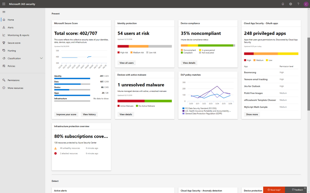
Customers will also notice right on the Home page of Microsoft 365 security center, there is a quick overview card called Microsoft Secure Score which exposes one of the more substantial changes that we’ve made for the release. Based upon customer feedback, we moved away from a product-based way of organizing scores (e.g. Windows, Office) to one that maps to the Microsoft Threat Protection entities. This means scores are now organized around the concepts of Identity, Devices, Data, Apps, and Infrastructure rather than the underlying products and technologies. This will help the many companies that organize their security administration efforts around these domains.
Microsoft Secure Score work space
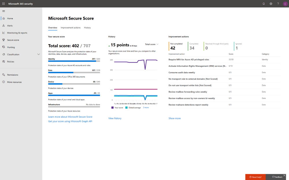
When you drill into the overview card from the Home page you will land in the Microsoft Secure Score work space. Here you can view a higher fidelity version of the quick overview card. It includes a section to overview Your secure score, a History section to show your status over time and finally a list of key Improvement actions and overall status.
Improvement action changes
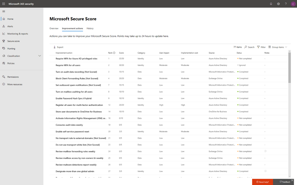
If you drill into the Improvement actions section, you’ll find several usability improvements. First you will notice that the improvement actions list now has much more space, which has enabled us to surface new columns and data. With this change you can now sort the list by User Impact, Implementation Cost, Category, and Source making it far easier to identify the right improvement actions to focus on and prioritize.
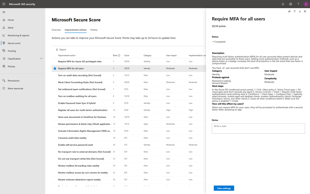
Another way we enhanced the user experience is by moving the improvement action details into a fly-out that appears from the right hands side of the page. Now you can quickly navigate from one item to the next without losing access to the list. Previously, the list would be obscured or pushed out of view when an improvement action’s detailed view was opened. Far fewer clicks and scrolling!
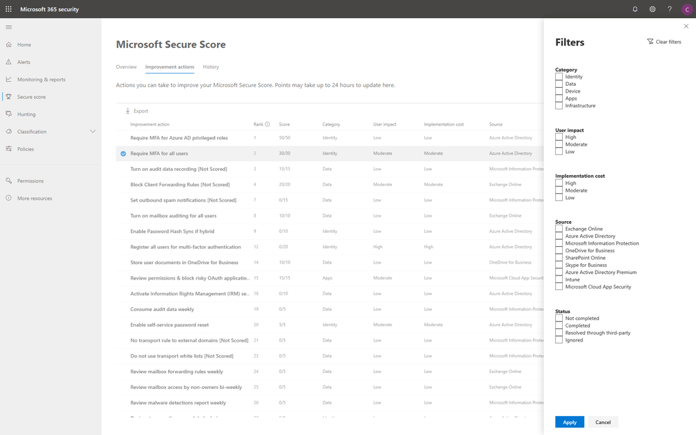
Next, we’ve improved the Filters capability to make it easier to find the right improvement actions to focus on. Imagine you’re the security administrator for Identity and you’re looking to score some quick points to keep your boss happy. Now you can Filter by Identity, low cost, and low user impact to find the improvement actions that you can complete with minimal effort and within the shortest possible time.
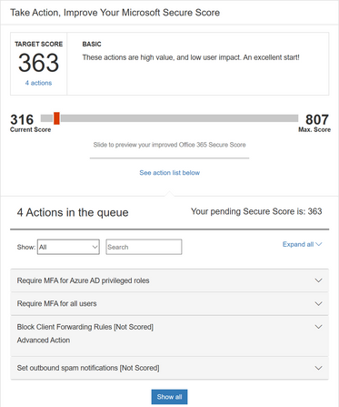
This new more advanced filtering capability replaces the Target Score capability shown below which looked nice in demos, but really didn’t pan out on the usability side. With the new advanced filtering capability, you’ll get more control, better slicing and dicing capabilities, and be able to get to the answers you need faster than before.
History and Score Comparison Changes
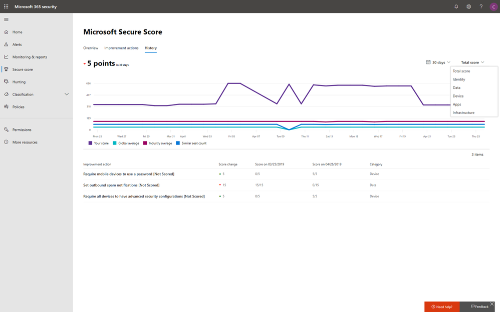
The last set of changes we will tell you about today are related to the Score Analyzer and Score Comparison experiences. In this release we’ve combined these experiences into one that is now called History.
The previous Score Comparison capabilities which enabled you to compare your score vs. the global average and customers who have a similar profiles to your own (i.e.: same industry and seat count) is still there, but it is much improved. We now provide comparison history data over time as opposed the previous experience which just enabled you to compare yourself vs. others based on the latest status information.
One additional improvement we added is a filter option which enables security administrators to filter history by domain (e.g. Identity, Device, etc.)
What about API’s?
Last September at Ignite we announced Microsoft Graph Security API support for Microsoft Secure Score and launched our public preview. We are pleased to announce that the API has now reached general availability and is ready for production use. The API provides full access to all the data we are using in our own Microsoft Secure Score user experience along with significant performance and localization improvements. Learn more about the Microsoft Graph Security API and how to use it.
Wrapping it up
So, there you have it – a quick tour of our newly redesigned Microsoft Secure Score experiences. We encourage customers to start taking advantage of it in its brand new home and for those that aren’t we would love to see you begin trialing one of the many Microsoft 365 security products that will give you access. More information on Microsoft Secure Score can be found at Microsoft Docs.

