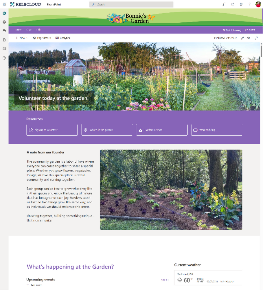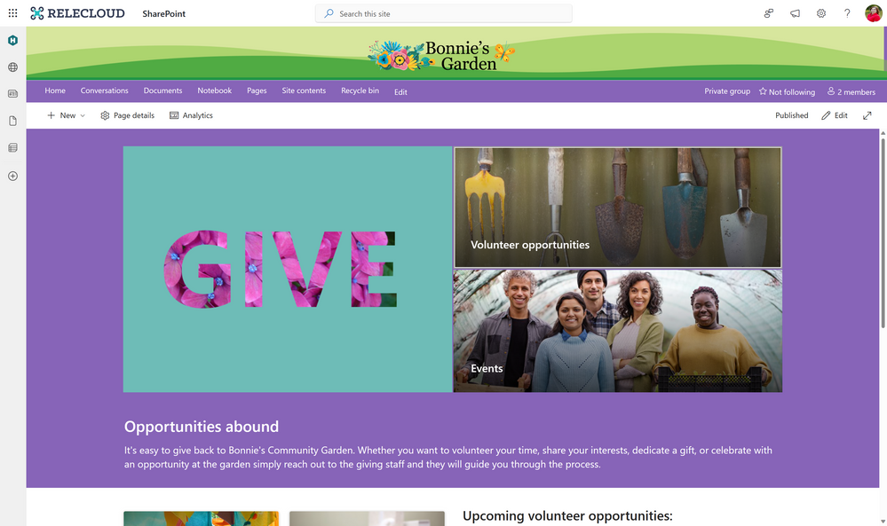
For many people getting started with your pages and sites is the hard part. Not knowing exactly what you want to build or how you want your site or page to look. In this blog we will utilize the Bonnie’s Community Garden volunteer site as our basis to take a deep dive into how you can build out a beautiful site using the tools available to you in today’s Modern SharePoint Online sites.
Let’s examine the scenario that we want to use our site to highlight:
“At Relecloud we believe in giving back to our community and this quarter we want to highlight the new Giving opportunity in Bonnie’s Community Garden. We will utilize a new site that will link off our existing Give site to highlight the organization, share details about the opportunities available for our employees and their families to participate in, get engaged and sign up to participate, and even participate in conversations about this garden.”
In this blog we will build out both a Communication site and a Team site to highlight 2 different ways that you can build a beautiful site using modern SharePoint and to learn more tips and tricks for making these sites in your organization.
One of the best ways to get started with any site is to start from a site template. Once you have selected your site type, there are a wide variety of different scenario-based site templates that you can start from. With each site template, you can discover different designs, layouts, themes, contents, and scenarios that will help you get started building your site. When you are picking a template, it is important to note that you can utilize a template that is not your scenario but utilizes a design that you want to replicate or start from. This kind of a head start is a valuable way to begin your site as well. All the contents of a site template are completely editable and available for customization or deletion if desired or not needed.
In building our site, we will go through 6 different areas to evaluate what choices we made and how this impacted our site and what we were able to customize in these areas.
- Site type and template
- Themes and colors
- Site Headers and pages
- Images and content
- Layout and web parts
- The extras
Bonnie’s Community Garden – Communication site
| Bonnie’s Community Garden – Team site
|
1. Site Type and Template
Getting started creating your site begins with several choices. These choices can feel very daunting without understanding the impact of the choices. As you decide between Communication site and Team site the best news is that you can build beautiful sites with either.
Let’s look at the two site types and what the differences are.
Communication sites are the foundation of our company portals. These sites are best used to broadly share information across an organization. Communication sites can become a home site for your organization and are often utilized for Viva Connections.
Team sites are the foundation of our corporate collaboration. These sites are best used to collaborate and share information within groups of people within an organization. These sites are typically connected to a M365 group when utilizing the modern framework of SharePoint. Team sites can also be associated to Microsoft Teams and Yammer communities.
TIP: You cannot change between site types after creation.
A few things to note when making the choice between site types for design purposes:
| Communication site | Team site |
Full width sections Horizontal navigation only | Centered content Navigation orientation choice (vertical or horizontal) |
Site templates are a great resource to get started quickly for creating your sites. When you are first creating your site you often don’t know how you want your site to look, but you might know the scenario that you want your site to fit. Or the opposite might be true, you might know more about how you want your site to look and know less about your content. Both of these are valid options that using a site template can help you get started quickly.
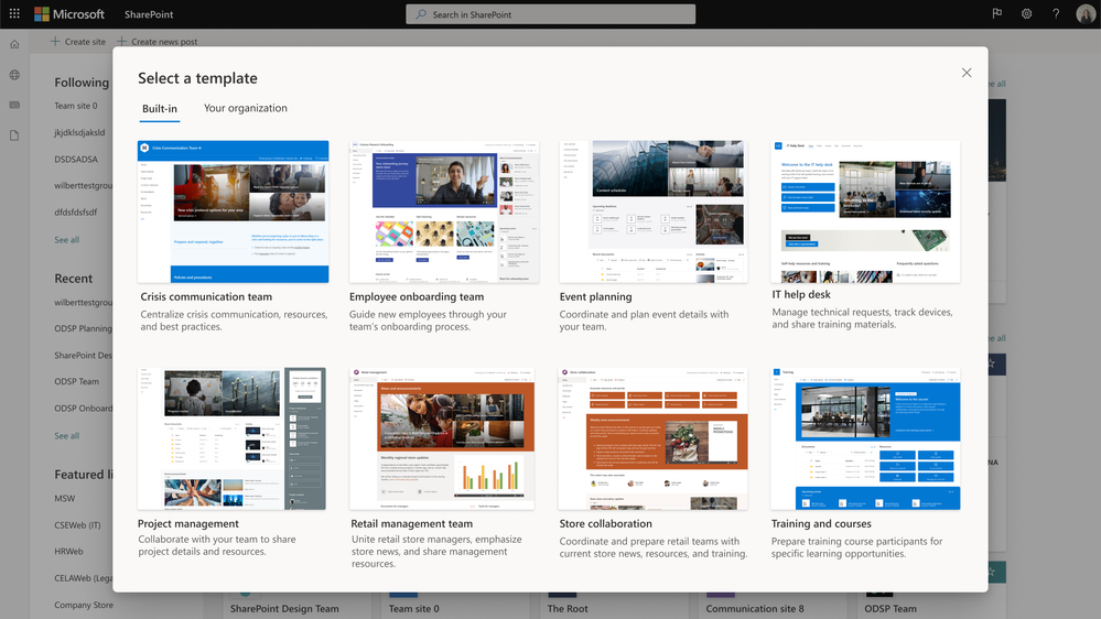
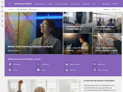
We took design inspiration from the color scheme with the site theme and the layout of the Learning Central site template to inspire our Bonnie’s Community Garden site, despite the content and scenario being completely different. By starting from a site template, we were able to replace the template content with our own content and get a head start on designing our site with inspiration.
2. Themes and Colors
When working on your site, one of the most impactful things you can customize is the color. The site theme has a very visual and distinct impact on your site.
SharePoint provides a set of themes that can be utilized on your sites that are based on Microsoft product color schemes. These themes offer a variety of options that will allow you to change the color of your site based on what your desired look is. You can also create your own custom themes to put your own colors into your SharePoint sites.

Working with themes it is important to keep in mind that accessibility is a necessity when you are designing your theme. You need to make smart choices to make sure that your colors have the correct contrast ratio. The SharePoint themes are evaluated and updated as needed to conform to accessibility standards.
When creating your own theme, there are many approaches you can take. The simplest approach is to customize one of the out of the box themes using Change the Look. This option gives you minimal options to change the main and accent colors using a set of provided color options.
If you are looking to create your own site theme, we always suggest you start by using the Fluent UI theme designer provided by Microsoft which you can find at: Aka.ms/themedesigner . This easy-to-use tool allows you to select your primary theme color, text color, and background color and will automatically generate everything needed for the theme file. The tool allows you to preview your theme on different controls and to confirm that it meets the proper accessibility contrast ratios. Once you have completed creation of your theme, you can utilize the Export theme button to save out your theme file to apply it to your tenant or site.
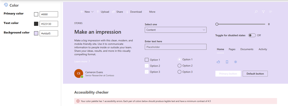

Using the Export option in the Theme Designer you will either utilize the JSON or PowerShell tabs to export your theme. Site themes have two primary options for application. The first and most common option is to install the theme as a tenant theme using PowerShell. This method allows the site theme to be available to all sites created within your organization under the Company themes heading in Change the Look. This option does require administrator privileges to perform the installation.
TIP: Install your theme using PowerShell and the PowerShell export of your site theme. Additional customization of your theme may be done prior to installation. Make sure you name your site theme appropriately; this name will be displayed in the Change the Look panel.
TIP: Adding an accent color will add an additional color to your theme in the Change the Look panel and in some limited display properties in the site.
For our Bonnie’s Community Garden site, I utilized one of the SharePoint themes (purple) to theme our site.
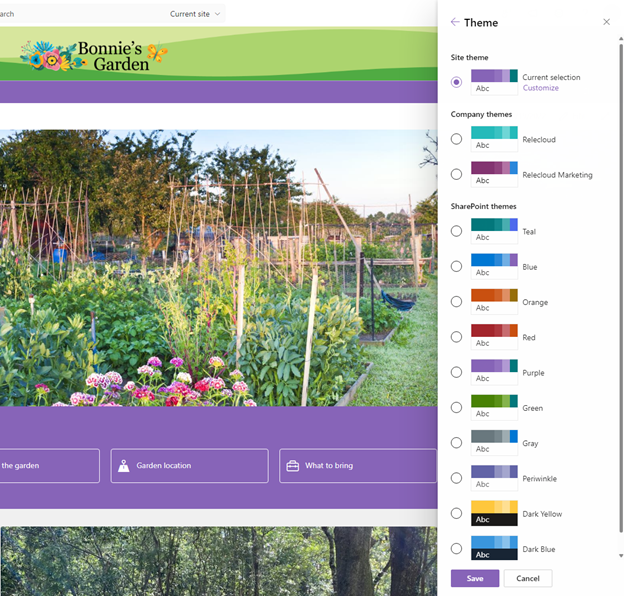
In many cases you do not find a theme you want to use for your site from your company themes or from the SharePoint site themes installed into your tenant. These sites might call for a one-off site theme for a special purpose or event. There are options for this type of theme, but they should be used sparingly and only in accordance with your organization’s rules and policies.
This second option for installing a site theme is to install one directly on a SharePoint site. This limits the usage of this theme to a single site. It also means that if you use Change the Look, the theme will not be listed as a company theme and if the theme is changed, you will need to reapply it. This theme is stored locally for use on the site it is applied to only, but not stored as a long-term theme. To utilize this method of side loading a site theme onto a single site, you will utilize our REST API method and the JSON code from your theme export.

In the sample site above using a side-loaded theme, you will notice that the theme name does not appear on the change the look panel and the theme is not available. If you change the theme from the panel, you will lose access to the installed theme from this method. This method should be used in a limited manner in your organization.
TIP: Install the theme from Site Contents to apply it to your site and make sure you rename the theme in your code.
Sample of a side loaded site theme. The theme only appears as the current selection in your site, it is not listed as an option to select. If you pick another theme in Change the look, this side loaded theme disappears.
TIP: Keep a copy of your full code to side load a theme in case it gets overwritten by another site owner accidentally, making it easy for you to reapply the theme.
3. Site Header and pages
Now that you picked the colors for your site, you can focus on building the site and the content within it. One of the first areas that you can utilize that will have an impact on your site is the site header. You have 4 different layout options to choose from in your header and each has its separate advantages.

In our Bonnie’s Community Garden sites, we decided to select the extended site header which allows us to select a background image and a larger site logo to customize the top of our site. By utilizing this site header layout, we are also able to introduce an additional color into the mix for our site by creating a custom image for the background of our site header space.
The extended site header layout option gives site owners/designers a unique opportunity to introduce a visual element that is a graphic or colorful way to introduce your site/brand to your users. Our Designing sites with beautiful headers blog gives you more details about what you should do in your site header. This does require a bit more of a design skillset than other site design components to create the custom site header background image.
For the Bonnie’s Garden site, we took advantage of the extended header to introduce a brand pattern in a unique color scheme that will not be utilized by the site theme creating a neutral background for our site logo and a pop of color at the top of the site. We can then use this color in our photographs and images throughout the site to introduce more consistency in our pages.

The extended site header layout option gives site owners/designers a unique opportunity to introduce a visual element that is a graphic or colorful way to introduce your site/brand to your users. Our Designing sites with beautiful headers blog gives you more details about what you should do in your site header.
For the Bonnie’s Garden site, we took advantage of the extended header to introduce a brand pattern in a unique color scheme that will not be utilized by the site theme creating a neutral background for our site logo and a pop of color at the top of the site. We can then use this color in our photographs and images throughout the site to introduce more consistency in our pages.
For our home page, we utilized the home page layout that does not have a page title region and allows our content to go directly to the top of the site under the site header. On additional pages and news, we have the option of using different page title layouts to create a break between the site header and the content on our pages/news posts to provide clear guidance for our users on their location in the site. This guidance is core to the user experience for understanding where a user is within your site.
Much like our site header we have multiple page title layouts to utilize to introduce our content to our users. It is important that the introduction of the page showcases the purpose of the page, and this is why the page title region is included on each page/news post you create.

Each of the different page title region layouts have a different impact on your content and page and allow you to influence the way that your users are introduced to your content. You can think about how you want to showcase your content right from the beginning with an image, title, additional headline (text above title), and details. You can be strategic with your use of the Text above title to group pages together and guide your users through an experience.
Giving back page – Communication siteImage and title layout
| Giving back page- Team siteHome page layout
|
TIP: If you want to use a page without the page title region you can copy your homepage and rename it to create a new page without the page title region.

