One of my favorite quotes about design comes from Mad Men. This quote says a lot about how we think of site headers for SharePoint Online and how we create layouts.
“Make it simple, but significant.” – Don Draper, Mad Men, Season 4, Episode 6, “Waldorf Stories”

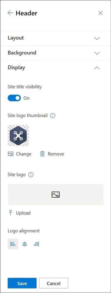
Branding your site header is an easy way to provide impact and expression to your SharePoint sites. Over the years we have heard great feedback from our customers that they would like more options for site headers. With this feedback in mind, we recently introduced 2 new site header layouts – Minimal and Extended. But this is not all we heard, so we added more header configuration options giving you more control over the elements in your headers. These simple and small changes can have a big impact on the look of your site. Each header can be used for different reasons and we want to go through a few of these options and recommendations with you.
By combining site logos, site headers, footers, and themes you can make striking changes to emphasize your brand within each site. Picking the right combination of options amongst the site header layouts and configuration options can emphasize or minimize the impact and focus of the brand and content.
When you begin to think about your site header, it is important to first understand what information is available to be included in the header. With this knowledge you can make informed choices about the layout and configuration options to truly make your brand shine on each site.
Content can be included in site headers:
Element | Description | Site Type | Recommendations |
Site Logo | Larger logo that can be non-square and transparent based off design uploaded | All | Size: 192 px width 64 px height Format: PNG, JPEG, SVG (svg not allowed for Group connected sites) |
Site Logo Thumbnail | A square logo thumbnail that is used if no site logo is uploaded or in places that a square format is required
This element is required. | All | Size: 64 px width; 64 px height Format: PNG, JPEG, SVG (svg not allowed for Group connected sites) |
Site Title | Text displayed for the site title.
This element is required. | All | Avoid repeating text in the site logo and site title if both are desired to be displayed |
Extended Layout Site Logo | The extended header layout has an extended site logo width. | All | Size: 300px wide x 64px height Format: jpeg, png, svg |
Extended Layout Background image | A new background image that can be utilized with the extended header. | All | Size: 2560px wide x 164px height Format: jpeg, png |
Horizontal Site Navigation | Navigation specific to the site in either Mega Menu or Cascading format | Communication |
|
Vertical Site Navigation/Quick Launch | Navigation specific to the site that appears on the left side of the site | Team |
|
Site Label (4 types)
| 1. Site Classification sets a label on a SharePoint site to protect and identify the content within the site. 2. Sensitivity labels are used across containers and can be applied to SharePoint sites as well as other Microsoft 365 products consistently. 3. Information Barriers indicator if configured and applied to the site. 4. Privacy Setting is a setting applied to the M365 Group for the site. | All | The type of site label is defined by what is configured for your tenant and type of site. This can vary from site to site based off your organizations policies. |
Following
| An indicator of whether the user has followed the site or not. | All |
|
Share
| A quick action icon to easily share the site with other users. | All *except private channel sites connected to Teams |
|
Membership | A count of the current members of a site/group are displayed if available. | Group connected team sites *except private channel sites connected to Teams |
|
Multilingual Picker/Language
| A language selector for the page if multilingual has been configured for the site. | All where configured |
|
With all these potential items that could be included in your site header, you will need to decide for each site how you want to present the content and intended use of your site. With these factors in mind, you can make the right choices for layout and configuration. For many sites, the focus might be the brand or showcasing a new concept, while for others the focus might be the contents of the site and information on the pages. Each header layout can assist in promoting the intent of your site and highlight your brand at the same time.
Let us start with the common header elements, once you determine the purpose of your site and select the theme that you wish to utilize, you can look towards the site header to provide information and impact for the site. The theme selected is an important related factor for your site header as it will determine the colors utilized in the header. You will make these selections through the Change the Look panel accessed through the Settings gear.
Minimal Header

The Minimal Header layout option is our smallest site header and will work best for sites where you want to provide a clear focus on the content or the hub navigation. This header utilizes the smallest height and the smallest site logo size possible. With the minimal nature of this header, it provides the least visual weight and impact on your site.
To best create a minimal header, we have minimized the content that is included in this header layout, you will find additional content in the overflow menu to the right of the header, including the multilingual language selector. The minimal header should be used very strategically on sites where this restricted content in the header will work best.
It is important to note that if you choose to use this minimal header layout for a multilingual sites the language selector is included in the ellipsis overflow menu.
Compact Header

If you use the site header layout of Compact, you will see an increase in the height of the site header and a single line of content across the header area. This layout option is best suited for most of your communication and team sites, allowing you to optimize the space afforded for your site content with a smaller height that includes the most information. Due to the flexibility of the compact header, it is the default header layout provisioned with each site.
With the compact layout you can provide additional wayfinding and identifying information by uploading a site logo. The site header background color, you can also add visual impact to your header with a header background color from your selected site theme.
Standard Header

The standard header layout increases the height of the site header and splits the site information into multiple lines for display purposes. This header layout is a good choice if you have a site not connected to a hub and have additional room to allow for the larger height.
You can also optimize the standard site header with a header background color from your site theme and site logo to highlight the site and give emphasis to site specific wayfinding.
Extended Header

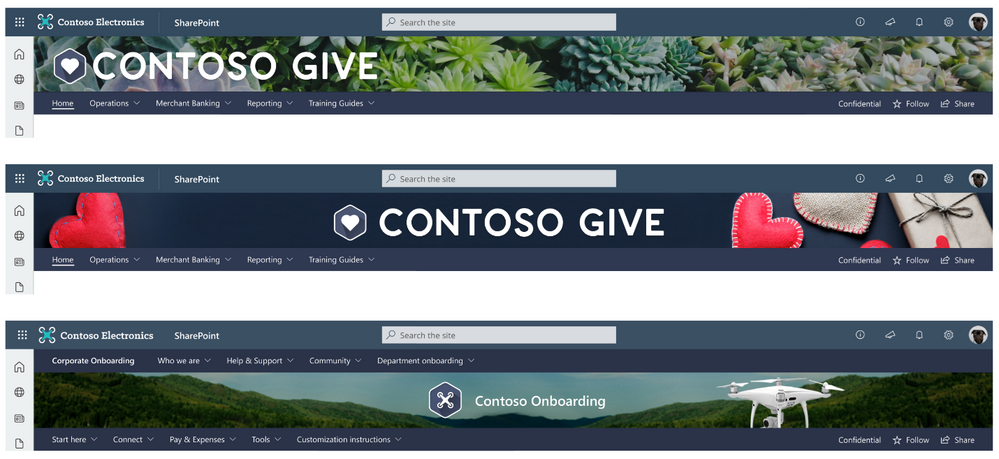
The extended header layout is the largest layout option that introduces a secondary area to provide a separate area for a background image or color. This layout should be utilized for sites that want to provide impact or become a showcase site for your organization brand or concept within your organization. For additional visual weight we have increased the maximum width site logo that can be included to provide additional impact and introduced the ability to align the logo left, center or right within the header. The site information and navigation (depending on site type) are moved below to a separate site theme colored bar for increased accessibility on these items.
There are some notable exceptions in behavior based on site type for the extended header. If your site is a Hub site and has been designated as Home, and you are utilizing the Extended Header, the site navigation will be removed. For these Hub + Home sites the Hub navigation bar will move to the bottom of the background image as the only navigation presented. If you are utilizing a team site template, you will notice that the navigation will continue to be presented on the left as the quick launch and not in the site header.
As you begin to explore using the extended header, there are a few design recommendations for how you should think about and design the extended header background images. These images will need to scale to fit both wide and small screens, without conflicts and introducing accessibility issues for the site logo and site title. We encourage you to think about these header background images in 3 distinct categories:
Brand Pattern:
By utilizing a pattern that is related to your brand in either shapes or colors, you can create a design that is visually appealing, while maintaining the appropriate open spaces for the site logo to avoid conflicts and potential accessibility issues with the site logo. These patterns will add great visual detail to your site.
Tips for creating brand patterns for your site headers:
- Use colors that are a part of your brand and related to the site theme.
- Repeating shapes, colors, and details can provide interest and simplicity.
- Keep your pattern simple.

Brand Photography:
A picture speaks a thousand words as they say, however photography is especially challenging in reduced height spaces like the site header that will need to scale for large and small width screens. Utilizing photography tied to your brand allows you to be specific on the items included in the photographs so that it relates to the content within the site, while also controlling the amount of visual focal draws within the image to keep clear focus on the site logo and site title.
Tips for picking photography for your site headers:
- Avoid the introduction of numerous visual elements.
- Keep colors to a minimum.
- Be aware of color contrasts.
- Provide clear open space for your site logo and site title.

Brand Illustration:
By creating an illustration for your site header, you can tie the content of the header to the visual elements of your image in a noticeably clear way. By custom tailoring an illustration for your brand and the site contents, you are able to increase the connection impact of your visual elements to the subject of the site.
Tips for brand illustrations in your site header:
- Minimize colors utilized in your illustration.
- Create or use illustrations that reinforce the content or focus of your site.

Brand can play a vital role in your portals and sites; these options will allow you to create the perfect introduction of your site to your users. As you can see, all these changes to site headers really took Don Draper’s advice to heart. While they are simple, they are significant.
No matter if you want to make a big splash, or provide minimal interruption, you cannot go wrong with any of these site header options. The additional configuration options for the site title and site logo thumbnail allow you to control the presentation of the visual and text elements for your site and brand throughout the SharePoint features. With these great options for site headers, we are excited to see the great ways that you use each of these layouts to enhance your SharePoint portals and experiences.
Want to learn even more about designing beautiful SharePoint sites, watch a full session in the Video
Hub:


