Publishers note: I am posting this on behalf my colleague Jon Nordstrom who is part of the Office 365 customer experience team. Myself and few other engineers thought you would all benefit from his knowledge of the Office 365 management activity API.
Once you have the data you need for your investigation, it can be helpful to use graphs to analyze activity data to identify relationships and outliers during an investigation. On TechNet we shared how the Office 365 team uses graphs to analyze incident data but in this last post of our two-part series we will focus on using Power BI to visualize the data for the following scenarios:
A. What changes have been made to my environment by Exchange administrators?
B. Is there excessive sign in failures from specific IP addresses?
C. Who has accessed sensitive content?
To help you understand how you can get the data necessary to perform a security analysis of it check out the previous post here.
The sample graphs generated in this post were created with the free version of the ZoomCharts add-in for Power BI Desktop. The data was transferred to Azure Cosmos DB using these sample scripts.
Use Cases
A. What changes were made to my environment by Exchange administrators?
What operations can I expect of my Exchange Online administrators and what operations do they have in common? Has an account run any commands that allow for access to user data? Are there any connections between these operations?
Figure 1 is a sample where we are only looking at the Exchange Operations. Looking at the pure count of operations may be good for alerts but how is it all connected?
To filter on Exchange Online events from Power BI, search the Fields pane for “workloads”, drag the workloads field to Page level filters and select the workload to filter on. When working with large sets of data either filter the information on import to Power BI or add a page level filter for Exchange operations.
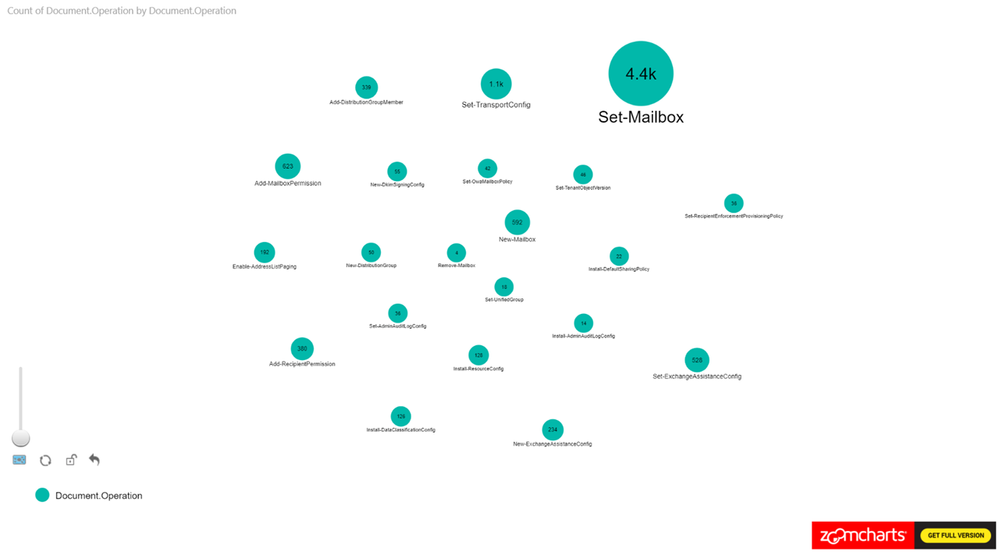
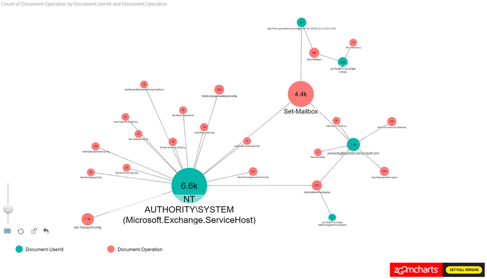
Let’s expand this scenario to understand the actors, since the operations in isolation doesn’t provide us with the data needed for an investigation.
In this example, we set the Nodes to Operations and UserId. The Measure is set to Operations see Figure 2 for the configuration.
This is a new tenant with many new accounts, so it is expected to see operations performed by the service itself as identified by “NT AUTHORITYSYSTEM” within the logs. You can identify cmdlets that are shared between actors and cmdlets that are unique to specific actors.
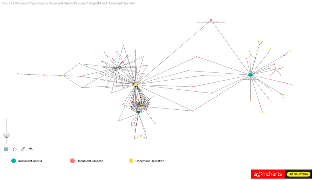
As a next step add the ObjectID to the Power BI view. The number of operations that have been carried out is shown along with any user objects that have been modified. We can see a cluster forming around one of the administrator accounts. As a next step we are zooming in to that cluster.
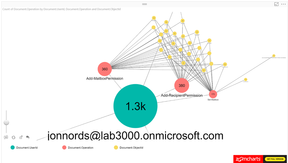
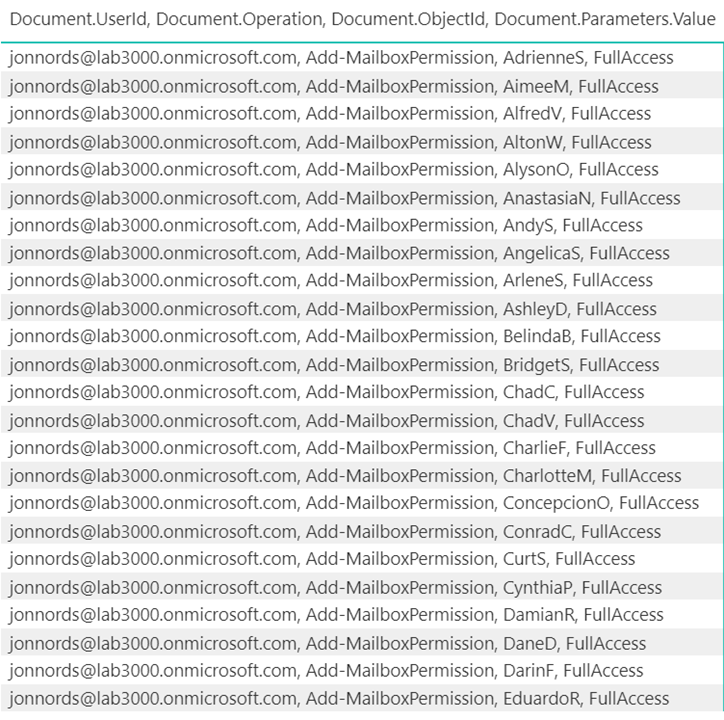
When zooming in on the cluster we can see Add-MailboxPermissions being run on several mailboxes. If this was to occur in a production tenant it should raise some flags.
The next step is to filter and understand permissions that have been provisioned. You can add a table that is filtered based on the graphs. In this example, the Administrator has granted FullAccess to these mailboxes. Not a best practice… This information can be used to reverse the change by exporting the data to a csv file and loop through the modified mailboxes using Remove-MailboxPermissions.
B. Is there excessive sign in failures from specific IP addresses?
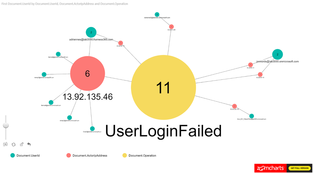
This example was derived from a test of the Password Spray attack simulation from the Attack Simulator feature in Office 365 Threat Intelligence. One key element of creating this view is to remember to exclude internal proxies, etc., from filtering to get a representative view. IP addresses with a high ratio of failures will beacon clearly in the report even when the report contains a lot of data. Look for how data is clustered together.
As can be seen in Figure 6., we have loaded UserId, ActorIpAddress, Operation as nodes and we are using the count of UserID as the measure.
C. Who has accessed sensitive content?
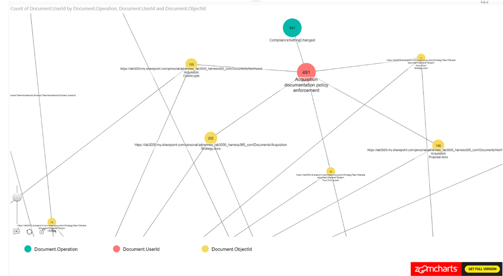
This example is based on filtering SharePoint Online and OneDrive for Business activity to identify users who have accessed information that has the “Acquisition documentation policy enforcement” label policy applied. This view can be used to understand if new sensitive content is accessed. The policy creates an account that is used to update the sensitive content and we can use the account to link to the usage.
From Figure 7., you can see that we have been using Operation, UserID, ObjectID for the nodes and loaded count of operations as the measure.
Summary
This post hopefully peak your interest in Graph based security analysis. If you think that analyzing data in Graphs seems like something that your organization may benefit from we hope that we have helped you get started.
We have only scratched the surface though. There are many scenarios where this may be a useful approach to get a deeper understanding. Go ahead and use the steps from the first post in the series to setup your own environment and work on your own model for Graph based analysis.
If you have any feedback please provide it at the GitHub project page or by emailing it to cxprad@microsoft.com.
We look forward to hearing from you!
—Jon Nordstrom, senior program manager, Office 365 customer experience


