It is time to further organize your modern intranet – building with SharePoint and Microsoft 365 – to enhance employee engagement and change the look of your sites so they work for you. Sites (portals) help bring together people and information that reflect your organization. It’s about getting things done – finding where you need to go—with effective navigation and common page elements.
“Megamenu and header layouts will make sites more appealing to groups that have diverse needs for pages and site navigation. It will really make my life easier in many ways as a solution architect for my company. While it’s a look and feel update, these are the features that the end users really notice and makes a big impact.” – verbatim cloud admin feedback sent to Microsoft in reply to the corresponding message center post.
Site owners can now use:
- Megamenus to better organize and showcase their site’s navigation items.
- Updated “Change the look” edit pane consolidates all modern site look & feel options.
- Site headers allow adjustment of layout options, logo and background choices.
- Site footers allow logo, text and links to be added to the bottom of pages.
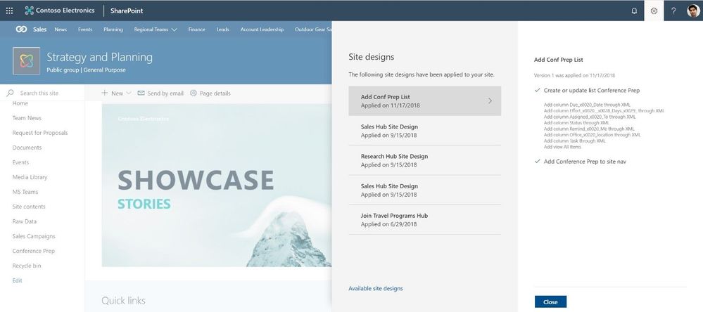
- Site settings > Site designs to view any applied site designs and apply additional ones.
We will first begin rolling out these new “change the look” features in February 2019 to Office 365 customers that have opted into the Targeted Release program. And then in March 2019, we will begin roll out to Office 365 customers on Standard Release, followed by rolling out to our sovereign data centers (like Office 365 for government (known as GCC)).
Let’s dive into the details and screenshots of each new and updated “change the look” options – all important additions for site owners to configure a more-engaging SharePoint site – a more modern intranet.
Organize your site navigation with SharePoint megamenus
The most effective SharePoint sites (and web sites in general) help visitors find what they need quickly so that they can use the information they find to make decisions, learn about what is going on, access the tools they need, or engage with colleagues to help solve a problem. Even when search is available, most visitors start their web experiences by navigating.
Now you can change the navigation style to increase the value of your site navigation. The new Megamenu options allow for multiple levels of hierarchy at once – no cascading fly-outs needed. This will enable you to better organize and showcase the content and sites. And of course, for sites that don’t need the megamenu look and feel, you can still use the Cascading option. You simply go into the Change the look edit pane, click on Navigation and choose between Megamenu and Cascading. You then add and adjust your navigation items inline as you had before – now with a new megatastic look if you choose.
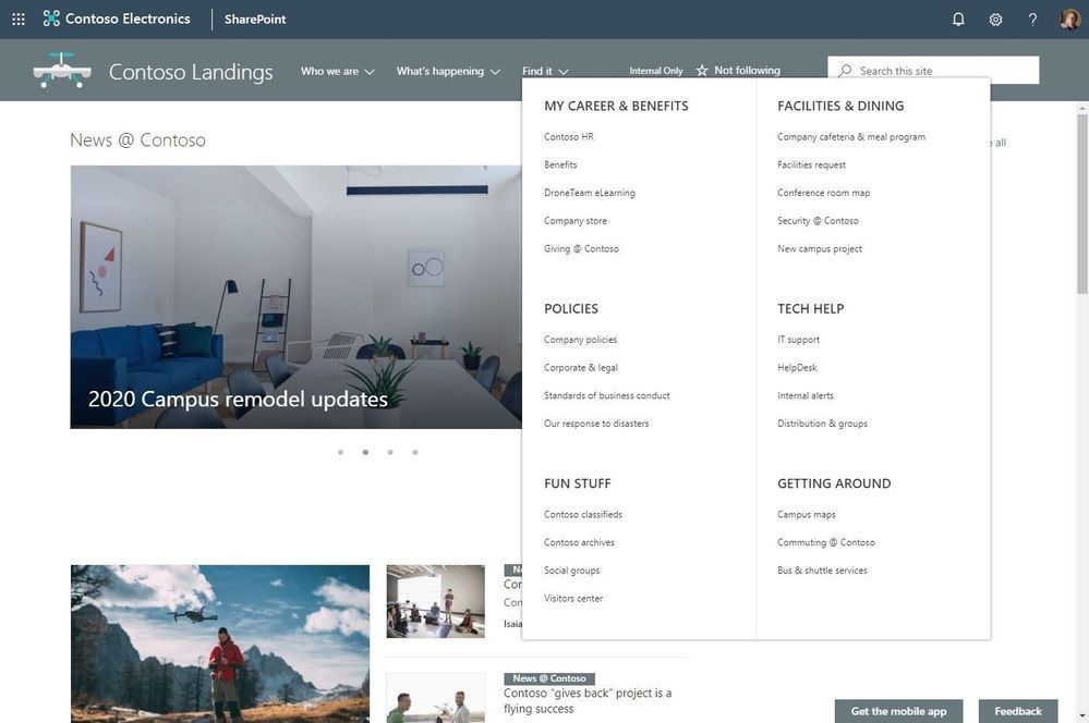
Navigation should always be planned from the perspective of the user of information – the visitors to your site. And why not present them with a beautiful, organized megamenu. Note: the megamenu navigation layout is only available for horizontally oriented navigations and allows for a panel display of links up to three levels.
Learn how to customize the navigation on your SharePoint site. And review the Microsoft guidance on planning navigation for the modern SharePoint intranet.
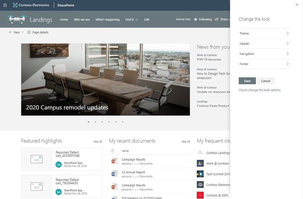
Updated Change the look edit pane gives access to control site structure
We have consolidated several look & feel site settings into an updated Change the look edit pane – including where you go to turn on the megamenu option. The Change the look edit pane provides access to site settings for theming, header, navigation and footer options.
Adjust the header of your sites
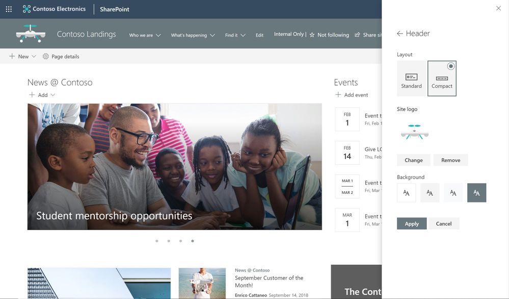
Site owners control the header portion of a site with a few simple configuration choices. First, they choose between two layout options: standard and compact. Second, choose a site logo. And third, modern site headers support backgrounds to make it easier to see the distinct header section and adds visual variety at the top of the site; you’ll see four distinct background options.
Adjust the footer of your sites
When site owners change the look of their site, they can now add a site footer to showcase common information at the bottom of your site – like a logo, text and hyperlinks. If site owners choose not to use a logo image file, they can still add text that will appear on the bottom left. Text with links will appear on the bottom right.
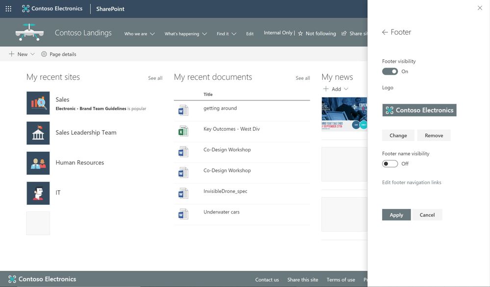
Note: configuring the footer is only available in pages and news articles in SharePoint communication sites. It will not appear at the bottom of SharePoint lists or document libraries within these same communication sites, and it will not available in SharePoint team sites. You will also be able to turn off footers from the “Change the look” panel after this feature rolls out to you. When this feature rolls out, all existing communication sites will get a basic site footer. If you want to turn off the footer control before its rolled out to you, please follow these instructions to turn off footer using PowerShell.
Learn more how to adjust the look of your SharePoint site footer. Learn more how you can “change the look” of your SharePoint site in Office 365.
New site designs panel for site owners
We are providing a new site setting to view any applied Site designs and apply additional ones – from within the sites themselves. The new site setting option is for site owners to display a new site design information panel. If any site designs have been published to the tenant, they will be displayed in the picker. Only site owners and site collection administrators have access to invoke this panel – and it respects any additional scopes on the published site designs, so only those available to the viewer will be displayed. If any sites designs have been applied to the site, they will also be displayed and can be selected to view what changes were applied.
Learn more about working with SharePoint site design and site scripts.
Try more and more of what SharePoint offers, and let us know what you think
Build your modern intranet on SharePoint in Office 365 and get the benefits of investing in business outcomes – reducing IT and development costs, increasing business speed and agility, and up-leveling the dynamic and welcoming nature of your intranet.
In all, we encourage you to build out and organize your sites, your intranet – the way you want them to be consumed in context of your content. As you progress year over year, keep creating and sharing structured, easy-to-navigate experiences to your audience.
We want to empower you and every person on your team to achieve more. Let us know what you need next. We are always open to feedback via UserVoice and continued dialog in the SharePoint community in the Microsoft Tech Community —and we always have an eye on tweets to @SharePoint. Let us know.
—Mark Kashman, senior product manager for the SharePoint team
FAQs
Q: When is this all being released in Office 365?
A: Our goal is to release all the items to Targeted Release customers in Office 365 by the end of February 2019, with release to all Office 365 productions customers by the end of March 2019.
Q: Is this the same set of features Office 365 cloud admins were notified about via the message center – two message center posts: MC165552 and MC 172503?
A: Yes. Microsoft first sent MC165552 (“Updated feature: we’re rolling out new SharePoint Online site branding and navigation features), and then we paused roll out. Recently, we sent the follow up MC172503 (“Updated Feature: New site branding and mega menu navigation features are rolling out”) to indicate that we were moving forward to release this set of features.


