There’s a SharePoint page for that. From content-rich home pages that serves entire organizations, to recurring quarterly business review read outs, to internal campaigns, to “welcome to the company” starter pages. As the rich capabilities of modern SharePoint pages evolve, all communicators can better design and promote their information throughout their team and across the organization.
We are excited to announce the following page enhancements (screenshots + links to learn more below):
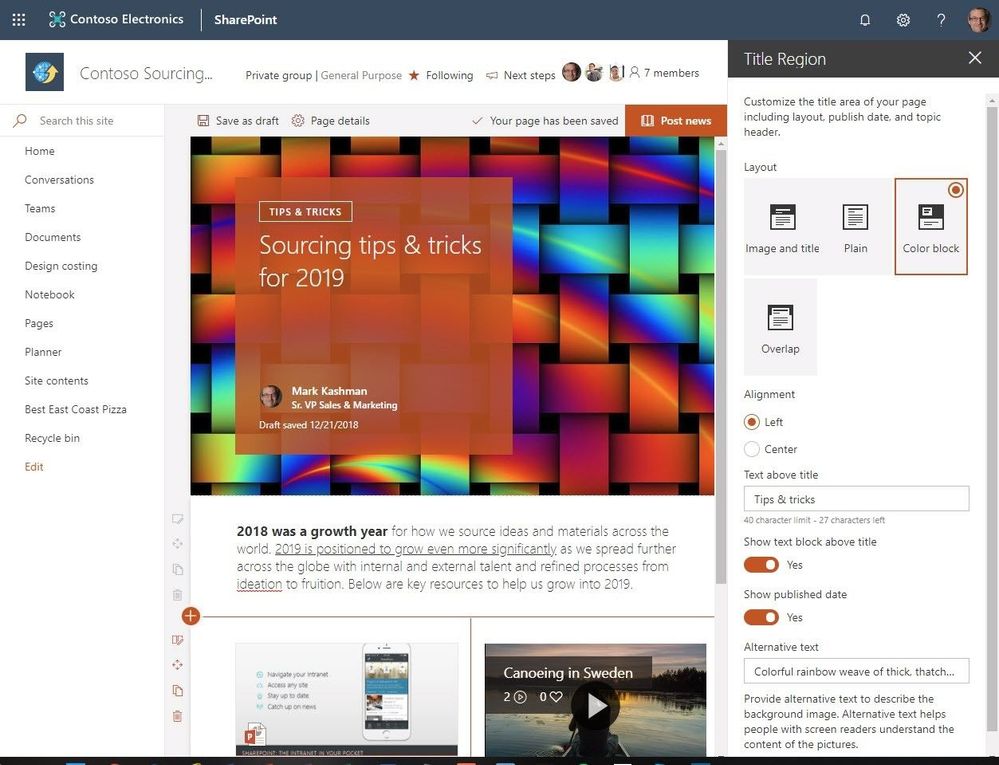
- Customize title region | control what the title region of each page looks like (layout, alignment, title, date).
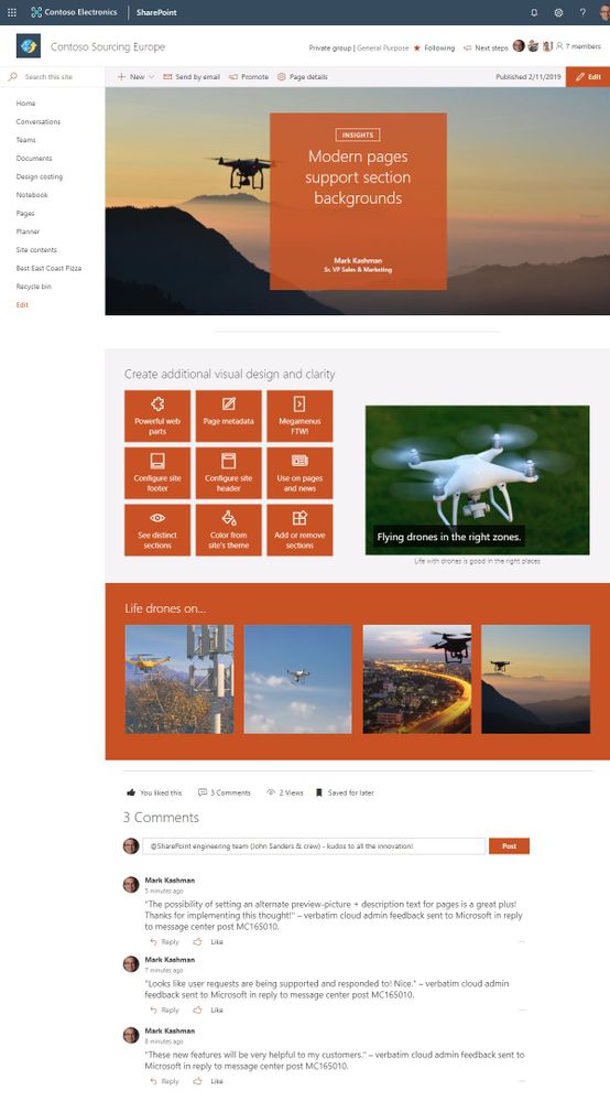
- Section backgrounds | display as distinct sections with visual variety throughout the page.
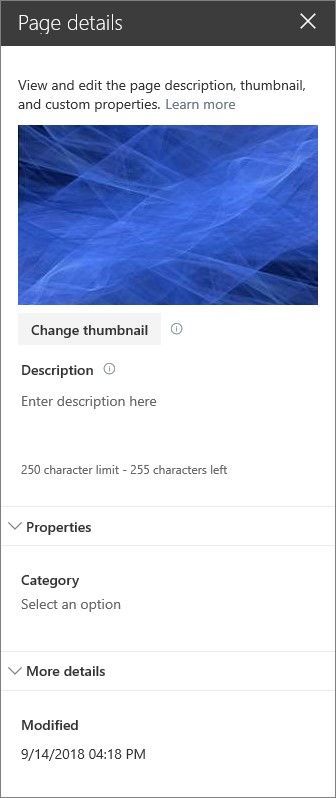
- Custom page thumbnails | Choose a preferred thumbnail from Page details.
- Custom page descriptions | Create a custom description from Page details.
- FYI: removal of the Feedback button in preparation of new feedback experience | in preparation for a new feedback experience coming soon, we are removing the current Feedback button from the site footer of all SharePoint home and modern site pages.
- FYI: removal of the pictures of the first three members of the group | Users who want to see members of the group can continue to click the Members link in the header to see the full membership list.
“We are reducing emails and creating a self-service culture where finding answers is as easy as searching for it on our intranet,” says David Pizzey: Manager, Centre of Excellence, Network and End User Services. “Office 365 surfaces personalized content across the suite, making it a great tool to search for information, and it even helps you make connections with areas of interest you might not even know existed.” [read the full Qantas Airways case study]
Let’s dive into the details of each new and updated page option – all powerful additions for communicators throughout your organization.
New and updated enhancements for SharePoint pages in Office 365
SharePoint pages are simple to create and publish, and they look great on any device. When creating a page, you can add and configure web parts, and then publish your page with just a click. And, as previously announced, you can configure the surrounding elements of the page (navigation, header, footer & theme). Now more than ever, creators and site owners present the information in an elegant, easy to consume fashion – with full context intact.
Customize the title region for each page. Modern SharePoint pages and news articles will now have more options to customize the title region of each page, with four layouts, two alignment choices, text badges above the title, the ability to change the displayed author, and show or hide the published date. Own the title and the rest will follow. Make it your own.

Modern pages support section backgrounds – this makes it easier to see the distinct sections and adds visual variety throughout the page. Create additional visual design and clarity as a user scrolls through your content. Now you can add colors from your site’s theme (neutral, soft & strong) to the background of your page sections or leave them white as they are by default.

Page owners can customize their page thumbnails and descriptions from within page details edit pane. Once adjusted, the content will then be represented in this way in search results, highlighted content, previews, and more – just the way you intended.
- Pages – choose new thumbnail – Choose a new thumbnail from Page details: Previously, the thumbnail image for a page (used in search results, highlighted content, and SharePoint News) was auto-selected. Now, you’ll be able to select your own thumbnail image.
- Pages – choose new description – Choose a new description from Page details: Previously, the first text that appeared on the page was auto-selected as the page description. You can now add your own custom description in Page details.

The SharePoint feedback button is being retired in preparation of new feedback experience
Starting the week of February 18th, 2019, we’re removing the product Feedback button from the site footer of all SharePoint home and modern site pages. For SharePoint users to easily provide product feedback and suggestions we included a footer link to our SharePoint UserVoice forums. Customer feedback continues to help us prioritize our work. We’ll be adding new ways to send feedback from the navigation bar in the coming months.
Note: If you had previously enabled or disabled the button using the Set-SPOTenant -UserVoiceForFeedbackEnabled property, this setting will no longer be required as the button will no longer be displayed for any tenant sites.
Removing the circular pictures of the first three members of the group
We’re updating the design of the site header for SharePoint sites connected to Office 365 groups. In favor or a more-simple interface, we are removing the circular pictures of the first three members of the group. This was static to the first three members, and duplicative to existing functionality – access to the members of the group. Users who want to see members of the group can continue to click the Members link in the header to see the full membership list.
Try more and more of what SharePoint offers, and let us know what you think
In all, we encourage you to build out and organize your sites, your pages, your intranet – the way you want them to be consumed in context of your content. As you progress year over year, keep creating and sharing structured, easy-to-navigate experiences to your audience.
We want to empower you and every person on your team to achieve more. Let us know what you need next. We are always open to feedback via UserVoice and continued dialog in the SharePoint community in the Microsoft Tech Community —and we always have an eye on tweets to @SharePoint. Let us know.
—Mark Kashman, senior product manager for the SharePoint team
FAQ
Q: When is this all being released in Office 365?
A: All the above items have been released to Targeted Release customers in Office 365. We plan to fully release to all full production Office 365 customers by the end of February 2019.


